How to Match Shirts With Jordan 7 Colorways
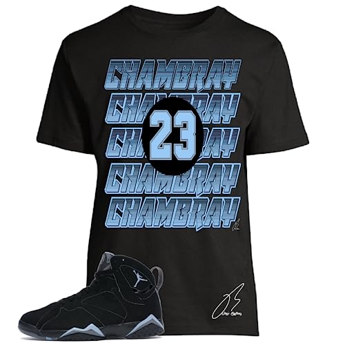
Quick answer: Match a Jordan 7 colorway by identifying the shoe’s dominant color, a secondary panel color, and its smallest high-contrast accent. Choose a shirt that repeats only one of those roles, then keep the pants and outer layer quiet. Seller labels such as Citrus, Cardinal, Chambray/UNC, White Infrared, Black Olive/Neutral, and Barely Grape/Purple are shopping cues; verify the visible colors against your exact pair.
The Air Jordan 7 has enough paneling and contrast to make a full head-to-toe color copy unnecessary. Most outfits improve when the shirt makes one clear connection and then stops. This guide organizes the current Jordan 7 matching-shirts collection by palette strategy so you can decide whether to echo an accent, create contrast, or keep the tee neutral.
Start with what you can actually see
Colorway names can be memorable, but names are not color standards. Look at the pair in natural light and separate the visible palette into three parts. The dominant color covers the largest areas. The secondary color defines major panels or structure. The accent is the smaller bright or contrasting detail that catches the eye. A shirt may coordinate with any one of these parts without copying all three.
When comparing online, place a clear sneaker image next to the shirt image. Avoid deciding from title words alone. A seller may use “infrared,” “cardinal,” “chambray,” or “grape” descriptively, while a brand archive or another retailer may use terminology differently. Material, photo lighting, and screen calibration also change how a shade appears.
Chambray and blue-led combinations
A blue-led Jordan 7 outfit can move in two useful directions. The first is tonal: repeat a blue accent in the shirt graphic and use dark denim or black pants. The second is high contrast: use a black base with a blue detail so the sneakers remain the brighter object. Both approaches are more controlled than adding blue shoes, a blue shirt, blue pants, and a blue cap at once.
In the current collection, the seller-labeled Chambray/UNC records use a black shirt base. That structure is easy to style because black contains the graphic while the blue cue supplies the connection. If the sneaker’s blue looks lighter or greyer than the print, treat the relationship as coordinated rather than an exact match.
Amazon links on this page currently have no Associates tracking ID.
View the saved Chambray/UNC 23 shirt record on Amazon
Citrus and orange-accent combinations
Orange or citrus accents are visually strong even when they cover little of the shoe. Repeating that color in a small part of the shirt graphic is usually enough. A black shirt plus dark pants creates an evening or streetwear-oriented palette; faded blue denim gives the orange more casual contrast. White pants can work, but they turn the footwear and shirt print into two separate focal points, so the rest of the outfit should remain simple.
The current grid contains two black-base Citrus-labeled designs with different graphics. Choose between them by graphic message and scale, not simply because both titles use the same palette word. A typographic statement reads differently from a numeral-and-wing treatment. That distinction matters if the sneaker already has a visually busy upper.
View the saved Citrus 23 Wing shirt record on Amazon
Cardinal and red-accent combinations
Red is one of the easiest accents to overuse. A red detail on the shoe, a red-heavy graphic, red outerwear, and red accessories can flatten the hierarchy. Instead, select one large neutral area and one red repeat. A black-base tee makes red feel deeper and more contained. A white-base tee makes the red appear brighter and gives the outfit more daylight contrast.
If you are choosing between the collection’s black and white Cardinal-labeled records, start with the pants. Black shirt with black or charcoal bottoms creates a continuous base. White shirt with medium-wash denim feels lighter and separates the top from the footwear. Neither is universally superior; the better choice is the one that leaves the shoe and tee with distinct roles.
View the saved black Cardinal 23 Wing shirt record on Amazon
White Infrared combinations
A white-and-bright-accent sneaker presents a useful choice: repeat the light upper with a white tee, or frame it with a black tee. A white shirt creates continuity and can make the outfit feel cleaner. A black shirt creates separation and may make the light sneaker appear brighter. The accent color should remain limited to the print or one small accessory.
The current White Infrared-labeled records include different base colors, graphics, and saved sizes. Do not treat those differences as simple swatches on a single universal product. Open the exact record and verify what is offered. If you prefer a quieter look, choose the design with less printed area; if the tee should be the statement, a larger graphic can carry more of the palette.
Black Olive and neutral combinations
Olive, tan, black, and other muted tones reward texture more than color repetition. Instead of searching for an identical olive, build a family of related neutrals: black shirt, olive or khaki bottom, and a small cream or metallic accent. This produces cohesion even when the shirt print and sneaker panel are not the same shade.
Muted outfits also make graphic meaning more noticeable. Read the wording and imagery before choosing a tee; a coordinated palette does not automatically make a graphic right for the occasion. For a versatile outfit, use one expressive graphic and keep the outerwear unbranded or minimally detailed.
View the saved Black Olive/Neutral shirt record on Amazon
Barely Grape and purple combinations
Purple can be styled as the main color or as a narrow accent. When the sneaker already has several purple tones, a black-base shirt with a purple cue keeps the palette grounded. Grey bottoms soften the contrast, while black bottoms make the purple feel sharper. Light denim provides a cooler casual option without trying to duplicate the shoe.
Do not assume every item using “grape” or “purple” will coordinate with every purple Jordan release. Compare the actual images and decide whether the relationship is exact, tonal, or deliberately contrasting. A tonal match can still look intentional when the neutral base is consistent.
View the saved Barely Grape/Purple shirt record on Amazon
Three reliable matching formulas
1. Accent echo
Use a black or white tee whose print repeats the sneaker’s smallest bright accent. Add neutral pants. This formula works when you want the shoe to stay primary and is the safest starting point for a multicolor pair.
2. Base-and-midsole bridge
Choose the shirt base to echo a large white or black area on the sneaker, then let the graphic add one secondary color. This creates a visible bridge without requiring an exact shade match across different materials.
3. Controlled contrast
Select the opposite shirt base—black against a light shoe or white against a dark shoe—and repeat only one minor accent. This is useful when a tonal outfit would feel too heavy or too washed out.
Common mistakes to avoid
- Matching every visible color. Too many repetitions make the outfit look assembled from a checklist.
- Relying on a nickname. A label can guide the search, but the visible shoe and shirt should make the final decision.
- Ignoring graphic scale. A huge central print competes with a complex sneaker more than a compact design does.
- Adding another unrelated statement piece. Keep jackets, hats, and bags calmer when the shirt and sneaker are already expressive.
- Assuming size options. The current curated records may represent a specific saved size and base color.
How the Jordan 7 fits into the broader line
Nike’s official history identifies the Air Jordan 7 as a 1992 design by Tinker Hatfield. That history explains the model’s place in the line, but it does not verify the naming or color accuracy of third-party shirt listings. Use the archive for model context and use current product images for outfit decisions.
If you are choosing the shirt base before the palette, read black versus white shirts for Jordan 7 outfits. If the graphic and listed fit are the harder decision, use the Jordan 7 graphic tee fit and design guide. The broader Jordan matching-shirts hub can help when you rotate among several models.
Frequently asked questions
Does a Jordan 7 shirt need the exact sneaker color?
No. Repeating one recognizable accent or using a compatible neutral can create a deliberate outfit. An exact match is difficult across different fabrics, materials, photos, and releases.
Should the shirt or the sneaker be the focal point?
Choose one. For a detailed colorway, a quieter tee usually keeps attention on the shoe. For a simple pair, a larger shirt graphic can become the main statement.
Can I wear blue denim with a multicolor Jordan 7?
Yes. Medium or dark denim acts as a familiar neutral, especially when the shirt base is black or white and only one graphic color repeats the shoe.
How many accent colors should I repeat?
Usually one is enough. A second small repeat can work through an accessory, but it should not compete with the shirt graphic or the sneaker.
Are seller color labels official colorway names?
Not necessarily. Treat them as listing descriptors and compare the images with your exact sneaker. Official model history and third-party product naming serve different purposes.
Final verdict
The strongest Jordan 7 color match begins with visual roles, not a nickname. Identify the dominant, secondary, and accent colors; repeat one; and give the rest of the outfit a neutral foundation. This approach works across the current seller-labeled palettes while leaving enough separation for the shoe and shirt to be understood.