Black vs White Shirts for Jordan 7 Outfits
Quick answer: Choose a black shirt when you want to frame bright Jordan 7 accents, create a continuous line with dark pants, or keep a busy palette grounded. Choose a white shirt when you want a lighter outfit, stronger separation from dark shoes, or a cleaner background for the graphic. The decision should follow the shoe’s overall value, the graphic size, and the pants—not a rule that one base always matches better.
The current Jordan 7 shirts collection is weighted toward black-base records, with a smaller number of white-base choices. That inventory shape makes the contrast decision especially useful. This guide compares the visual effect of each base without assuming that two records with different sizes, prints, or Amazon destinations are interchangeable variants.
What a shirt base does in an outfit
The shirt base occupies more visual area than most printed accents. It controls how bright the upper body feels, how strongly the graphic separates, and whether the outfit connects to the pants. A good base can organize colors that are only approximate matches. A poor base can make accurate accent colors feel noisy because the overall value balance is wrong.
“Value” here means lightness or darkness, not price. A dark sneaker plus black tee plus black pants creates a low-value, continuous silhouette. A light sneaker plus white tee creates a high-value, open silhouette. Mixing a light shirt with a dark sneaker, or the reverse, produces contrast. None is automatically correct; each supports a different visual outcome.
When a black shirt is the stronger choice
The sneaker has several bright accents
Black gives red, orange, blue, purple, or metallic-looking print colors a stable boundary. If the Jordan 7 colorway already has multiple panel colors, the black field keeps the tee from introducing another large bright area. This makes it easier to repeat one accent while letting the shoe retain its complexity.
You want the footwear to read first
With black pants or charcoal denim, a black tee forms a vertical neutral block. A lighter or brighter sneaker then separates clearly at the bottom of the outfit. The shirt graphic can still reference the shoe, but it does not have to dominate.
You are layering
Black works under denim, olive, grey, or neutral jackets because it creates a consistent inner layer. If the jacket is already patterned, choose a black tee with a restrained graphic. If the jacket is plain, a larger shirt design has more room.
Amazon links on this page currently have no Associates tracking ID.
View the saved black Chambray/UNC Freshness shirt record on Amazon
When a white shirt is the stronger choice
The shoe has a substantial light upper or midsole
A white tee can repeat that broad light area and make the outfit feel intentional without adding another accent color. It is especially useful with medium-wash denim, grey shorts, or tan pants because the palette stays open rather than becoming a dark column.
The footwear is mostly dark
White creates immediate separation from a dark sneaker. This can prevent a black or olive pair from disappearing into black pants and a black shirt. The shirt graphic should still share one color or idea with the footwear so the contrast feels planned.
You want the graphic to be easy to read
Dark or saturated artwork often appears sharper on white. That can be helpful when the graphic is the primary statement. It can also be too much if the sneaker is visually complex, so consider using simpler pants and skipping a loud outer layer.
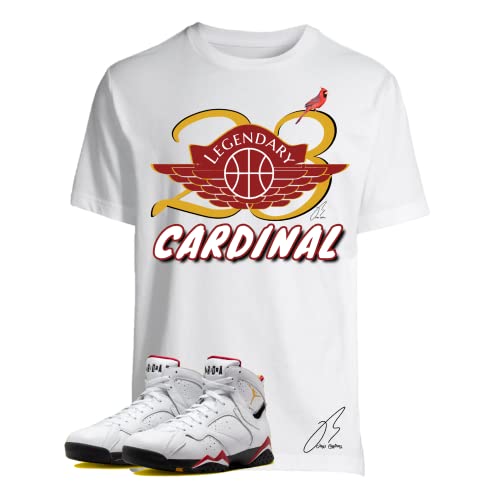
View the saved white Cardinal 23 Wing shirt record on Amazon
Black versus white by Jordan 7 palette
Chambray or blue-led pairs
Black makes blue accents feel deeper and works smoothly with dark denim. White gives blue a fresher, higher-contrast presentation and suits light denim or grey. Because the current Chambray-labeled records are black-base listings, compare their exact image rather than assuming a white counterpart exists in the same design.
Citrus or orange-led pairs
Black contains orange and gives it a sharper, night-oriented feel. White makes orange look brighter and more casual. If orange is only a narrow sneaker accent, either base can work; the deciding factor is whether you want the print or the shoe to be more prominent.
Cardinal or red-led pairs
Black-and-red is direct and compact. White-and-red has more breathing room and can echo a light upper. The current collection includes saved Cardinal records on both black and white, but their listed sizes differ. Compare the exact records rather than treating base color as the only difference.
White Infrared-labeled pairs
A black tee creates strong light-dark separation and can frame a bright accent. A white tee creates continuity with the light areas of the shoe. With either base, let the accent appear in one print element instead of repeating it across every accessory.
View the saved white White Infrared graphic shirt record on Amazon
Olive, neutral, or earth-tone pairs
Black is usually the simpler bridge because it supports olive, khaki, and muted tones without requiring a close shade match. White can brighten the palette but may need a neutral bottom—stone, grey, or olive—to reconnect the outfit.
Purple-led pairs
Black makes purple feel saturated and graphic. White makes it feel lighter and can reveal more variation between the shoe and print shades. If those purples are not exact, black often hides the difference better; white makes the tonal relationship more visible.
Let the pants settle the decision
Pants are the bridge between shirt and sneaker. With black pants, a black tee produces continuity while a white tee creates a clear break. With blue denim, both bases work: black feels more anchored, white more relaxed. Grey bottoms reduce the intensity of either choice and are helpful with red, purple, or orange accents. Khaki and stone add warmth and pair especially well with olive or neutral footwear.
If the shirt and shoe already share a strong accent, the pants do not need to repeat it. Use the pants to manage lightness and texture. This avoids the “three-piece color match” effect in which every item competes to prove that it belongs.
Consider graphic size before base color
A black tee with a very large bright print may be more visually assertive than a white tee with a compact dark design. Base color is only one part of the decision. Estimate how much of the shirt front the graphic occupies, where it sits, and how many colors it contains. When the sneaker has complex paneling, a smaller or simpler print often keeps the relationship balanced.
Typography also changes the tone. A phrase or slogan is read as a message as well as a shape. A numeral or wing-style motif may feel more emblematic. Choose a graphic you actually want to wear; color coordination does not make wording irrelevant.
Think about the setting
A black base is practical for an evening outfit, a layered look, or a high-contrast streetwear palette. A white base often feels natural in daylight, warm weather, or a cleaner casual combination. These are styling tendencies, not restrictions. Fabric weight, fit, weather, and the rest of the wardrobe matter more than a fixed season rule.
Exact record checks that prevent surprises
- Read the full title for the saved size and base color.
- Inspect the current Amazon image and selection details.
- Confirm that the graphic shown matches the wording you expect.
- Review material, care, seller, delivery, and return information on the destination.
- Do not assume another size or base uses the same ASIN or is currently available.
For color-first decisions, use the Jordan 7 colorway matching guide. For print placement, listed size, and silhouette, continue with the graphic tee fit and design guide. You can also browse the broader shirts to match Jordans hub.
Frequently asked questions
Is black always safer with a multicolor Jordan 7?
Black is often easier because it contains bright accents, but it can make an already dark outfit too heavy. Use a lighter bottom or outer layer when more separation is needed.
Does a white shirt have to match a white sneaker panel exactly?
No. Different materials rarely appear identical. The broad light-light relationship can be enough, especially when one graphic accent connects to the footwear.
Can I wear a white shirt with black jeans and a light Jordan 7?
Yes. The black jeans divide two light areas and keep the outfit from becoming washed out. A small dark element in the shirt graphic can strengthen that bridge.
Which base makes a large graphic look quieter?
Neither base guarantees that. Contrast between the print and base determines how strongly it reads. A large bright graphic on black can be louder than a dark print on white.
Should my hat match the shirt base?
It can, but it does not have to. A neutral hat that repeats the pants or a small sneaker accent may distribute the palette more naturally.
Final verdict
Pick black to ground color, support dark layering, or keep the sneaker in front. Pick white to create space, emphasize contrast, or connect to a light upper. Then check the graphic scale and pants. The better base is the one that gives every item a distinct role while preserving one clear connection to the Jordan 7.