Jordan 12 Graphic Tee Design Guide
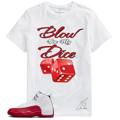
Quick Answer: Pick the graphic scale before chasing an exact color match. Large sneaker-themed prints create the loudest connection to Jordan 12 palettes; text-led designs communicate the theme with less imagery; and low-contrast graphics are easiest to reuse. The shoe, shirt and pants should not all compete for attention at the same time.
The Shirts to Match Jordan 12 collection contains dozens of current Amazon-linked records, including repeated size-level listings and several different design families. Color is the obvious filter, but graphic structure often determines whether the final outfit feels intentional or overloaded.
First decide where the focal point should be
If the sneaker is the focal point, choose a neutral shirt with a small or low-contrast graphic. If the shirt should share attention, use a medium or large design that repeats one color from the shoe. If the outfit is meant to be overtly theme-driven, a large sneaker-related graphic can work, but the pants, jacket and accessories should step back.
This focal-point decision is more reliable than trying to rank designs as universally subtle or bold. A white tee with a large red print can dominate a white-and-red shoe; a black tee with a dark red print may feel quieter even when the artwork is the same size.
Large sneaker-themed graphics
Large graphics create immediate coordination and are useful when the shirt is meant to carry the outfit. They work especially well with simple pants and minimal outerwear. The risk is repetition: a detailed shoe plus a detailed shirt plus patterned pants can fragment the outfit into several competing zones.
Use large graphics when at least two other elements are quiet. Black jeans, charcoal cargos or solid shorts give the design space. Keep bags and hats neutral. If a jacket covers most of the artwork, ask whether the remaining visible portion still looks intentional; sometimes a medium graphic survives layering better.
Amazon links on this page currently have no Associates tracking ID.
View the saved black-and-red Jordan 12 graphic tee listing on Amazon
Text-led and slogan designs
Text-led shirts can reference a colorway without reproducing a sneaker image. Their impact depends on contrast, letter size and how many lines occupy the chest. A short high-contrast phrase may be visually stronger than a complex illustration; a tonal wordmark can be much quieter.
Read the product title for the named palette, but rely on listing images to judge the actual print. Similar titles such as Taxi, Flu Game or Melo may describe different artwork, base colors and placement. A name organizes the records; it does not standardize the design.
View the saved Taxi text-and-graphic shirt listing on Amazon
Low-contrast graphics
Low contrast means the print sits close to the shirt base in value or saturation. Navy on black, grey on white or muted red on charcoal can support a Jordan 12 palette without pulling attention away from the shoe. These shirts are often easier to reuse with other footwear because the reference is less dependent on one exact color combination.
Low contrast is not the same as invisible. Check whether small text remains readable and whether the print boundary is clear in current photos. A subtle design can look refined in person but disappear under dim light or beneath a layer; decide whether that effect supports your outfit goal.
One accent versus multiple accents
A one-accent shirt repeats a single blue, red, purple or gold direction. It is easier to combine with neutral pants and outerwear. A multicolor graphic can connect several parts of the sneaker, but it should usually be the only multicolor element above the waist. If the shoe is already complex, repeating only one accent prevents a literal head-to-toe match.
The Jordan 12 colorway guide covers French Blue, Taxi, Cherry, Flu Game, Melo, Field Purple and Stealth strategies. Use it after choosing the graphic category so you are solving one decision at a time.
Base color controls the design
Black absorbs contrast and makes bright colors feel denser. White opens the composition and gives red, blue or gold more brightness. Navy supports blue pathways without demanding an exact match. Grey softens black-white and Stealth directions. The same printed colors can appear more or less intense depending on the base.
For Taxi, a white or black base with a limited gold accent is usually enough. For French Blue, navy creates continuity while white creates separation. For Cherry or Flu Game, black controls the red; white makes it more prominent. Field Purple graphics are easiest to manage against black.
View the saved Field Purple graphic tee listing on Amazon
Graphic placement and outerwear
Center-chest graphics remain visible beneath an open overshirt. Wide prints may be cut off by a jacket. Small left-chest marks can disappear under a zip layer but work well when the tee is worn alone. Before buying, imagine the shirt in the actual outfit and season rather than judging it only as a flat product image.
If you plan to wear a hoodie instead of a tee, read the Jordan 12 shirts versus hoodies comparison. A hoodie changes scale because the body, sleeves and hood make the base color more dominant.
Fit affects how the graphic reads
A stretched graphic can look wider and lower than it does in a flat photo. An oversized shirt gives the print more space but can move it farther from the waistline. A cropped or shorter fit places the design higher and exposes more of the pants. Use seller-provided measurements where available and compare them with a shirt you already wear.
Do not infer sizing from another record with a similar title. Several products in this collection are separate ASIN- and size-level destinations. Confirm the selected option, current chart and return information on the exact page.
A simple three-piece test
- Shoe: identify the main neutral and one accent.
- Shirt: choose one graphic category and decide whether it repeats the accent or stays neutral.
- Pants: select a solid neutral that separates the first two pieces.
If all three pieces demand attention, remove one graphic or reduce one color. If the outfit feels disconnected, repeat a small accent in the shirt or accessory. This test works without requiring an exact color match.
Evaluate the design from three distances
Product pages encourage close inspection, but outfits are rarely seen only from a few inches away. At close range, look for whether the print edges, small text and accent colors appear coherent. At conversation distance, check whether the image or slogan still reads as one clear element. From across a room, notice whether the shirt registers as mostly black, white, red, blue, purple or another base color. That distant color block often matters more to the outfit than the smallest graphic details.
This three-distance test helps separate two shirts that use the same palette. One may read as a black shirt with a red detail; another may read as a red-and-black graphic shirt. The first keeps attention lower on the sneaker, while the second creates two strong focal points. Choose based on the visual role you want rather than the number of matching colors.
Build a small rotation instead of repeating one formula
If you regularly wear the same Jordan 12 pair, three different shirt roles create more variety than three near-identical graphics. One neutral, low-contrast tee can handle everyday outfits. One colorway-led graphic can make the connection explicit. One text-led or alternate-base shirt can change the mood without requiring new pants or accessories. The aim is not to collect every listing; it is to cover distinct outfit functions.
Before adding a similar product, compare its base color, print scale and destination with what you already own. Size-level catalog records may look like new designs when they are actually another option of the same artwork. The live Amazon page is the right place to confirm whether the differences are meaningful.
Listing and affiliate notes
Retro Heritage organizes existing product records for comparison. It does not manufacture, sell, ship, authenticate or warranty them, and it does not claim physical testing. Amazon destinations can change in availability, option selection, seller and product detail. Review the live page before purchasing and treat material, print-method and care statements as listing-specific.
Frequently asked questions
Is a sneaker graphic better than a text-only shirt?
Neither is universally better. Sneaker graphics make the connection more obvious; text-led designs can be easier to balance and reuse.
Can a large graphic work with patterned pants?
It can, but the combination is visually busy. Solid pants usually give a large print and detailed sneaker more separation.
What makes a matching shirt versatile?
A neutral base, limited accent colors and a moderate graphic usually allow the shirt to work with more than one pair.
Does a white shirt always work with Jordan 12s?
White is flexible, but the graphic colors and the warmth of the white still matter. Compare the listing photos with your pair.
How do I choose between two similar product cards?
Open both exact destinations and compare the selected size, base color, artwork, seller details and return information. Similar catalog titles may represent separate ASINs.
Final verdict
The strongest design choice begins with hierarchy. Use a large graphic when the shirt should share the spotlight, a text-led design for a clearer but less literal reference, or a low-contrast print when the Jordan 12 should remain dominant. Keep the rest of the outfit quiet enough to support that decision, verify the live listing, and browse the complete Jordan 12 matching-shirts collection for the current records.